
BOOQ
MY ROLE: UX Research + Visual Design
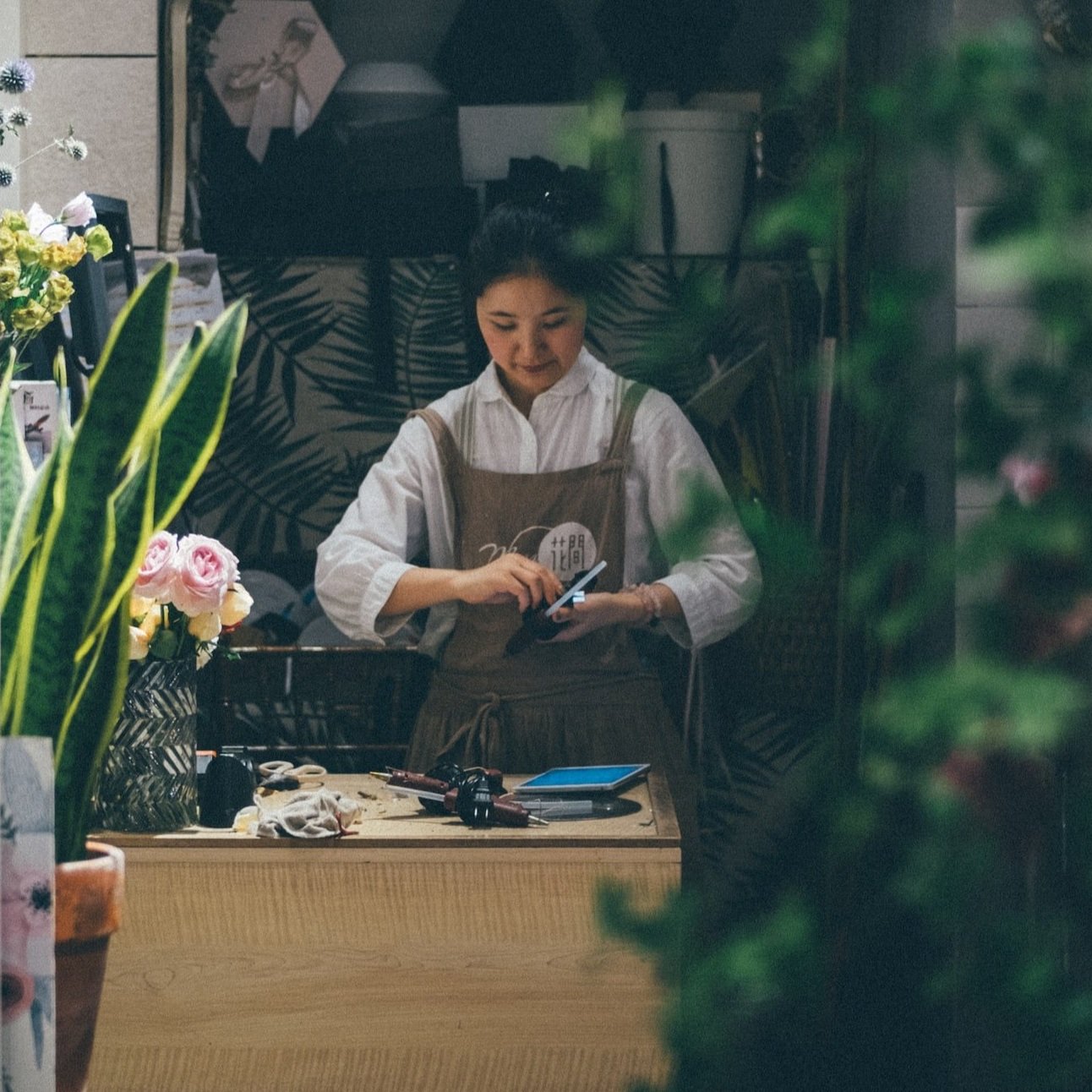
BOOQ is an app designed to help florists create and virtually preview their floral arrangements. This app will solve problems for new and experienced florists who are lacking accessible, easy-to-use technology for their design process. By allowing them to easily visualize and plan their arrangements, they will overcome administrative obstacles and be able to enjoy the creative process again.
Project Goal
Design a usable and useful interface for the new and experienced user
Provide clear design, inspiration, and saving processes
Create a minimalistic interface that allows the focus to be the user’s project
Design an app to allow florists to enjoy the creative process again
Objectives

TARGET USERS

Primary Persona
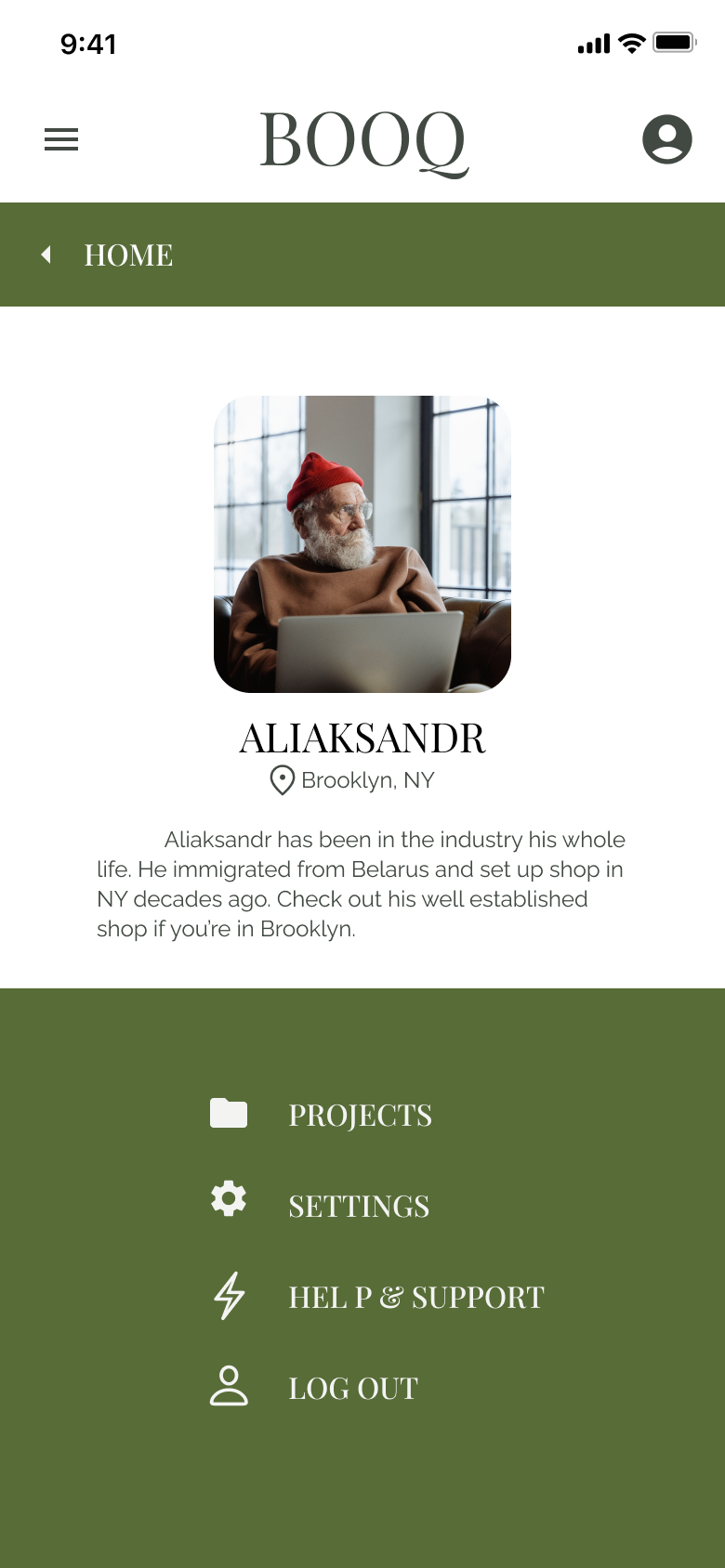
Age: 58
Education High school and some college
Location: Brooklyn, New York
Family: Lives with partner and cat
Aliaksandr has been in the floral world his entire life. He is a first generation immigrant from Belarus who settled in New York and set up shop decades ago. Business continues to grow, and he faces challenges that technology could probably help… but he is hesitant to invest in something he might not know how to use himself. After years in business he is ready to get back to his love of creating unique floral arrangements for his loyal clientele.
Reduce stress around the business tasks (inventory, marketing, etc).
Develop a renewed excitement around the creative process
Set his business apart from competition
Goals
“I’m hesitant to adopt new technology because things have been running my business fine without it for decades”
“I am frustrated with the inability to keep track of all the inventory details and I miss the creative process.”
Frustrations
Secondary Persona
Age: 29
Education B.S. Biology
Location: Chicago, Illinois
Family: single plant mom
Lila is a millennial midwesterner who has long loved plants. She has been making arrangements for friends and family as long as she can remember and is ready to make a career shift from biologist to full-time florist. The issue is that she doesn’t have a great handle on the business side of things, and she’s nervous to plan for larger order and events. She is eager to break into the industry with her unique perspective and passion!
Break into a new career as a florist!
Create systems for visualizing and placing large orders
Impress new and existing clients with ways to see what they are paying for.
Goals
“I haven’t had many business classes, so I know there is a lot to learn on the admin side.
“I’ve created arrangements for friends and family, but I’m not sure how plan and order for large events and inventory.”
Frustrations
Competitive Analysis
After comparing four companies representing both direct and indirect competition, Booq has the opportunity to fill a couple of gaps in the market.
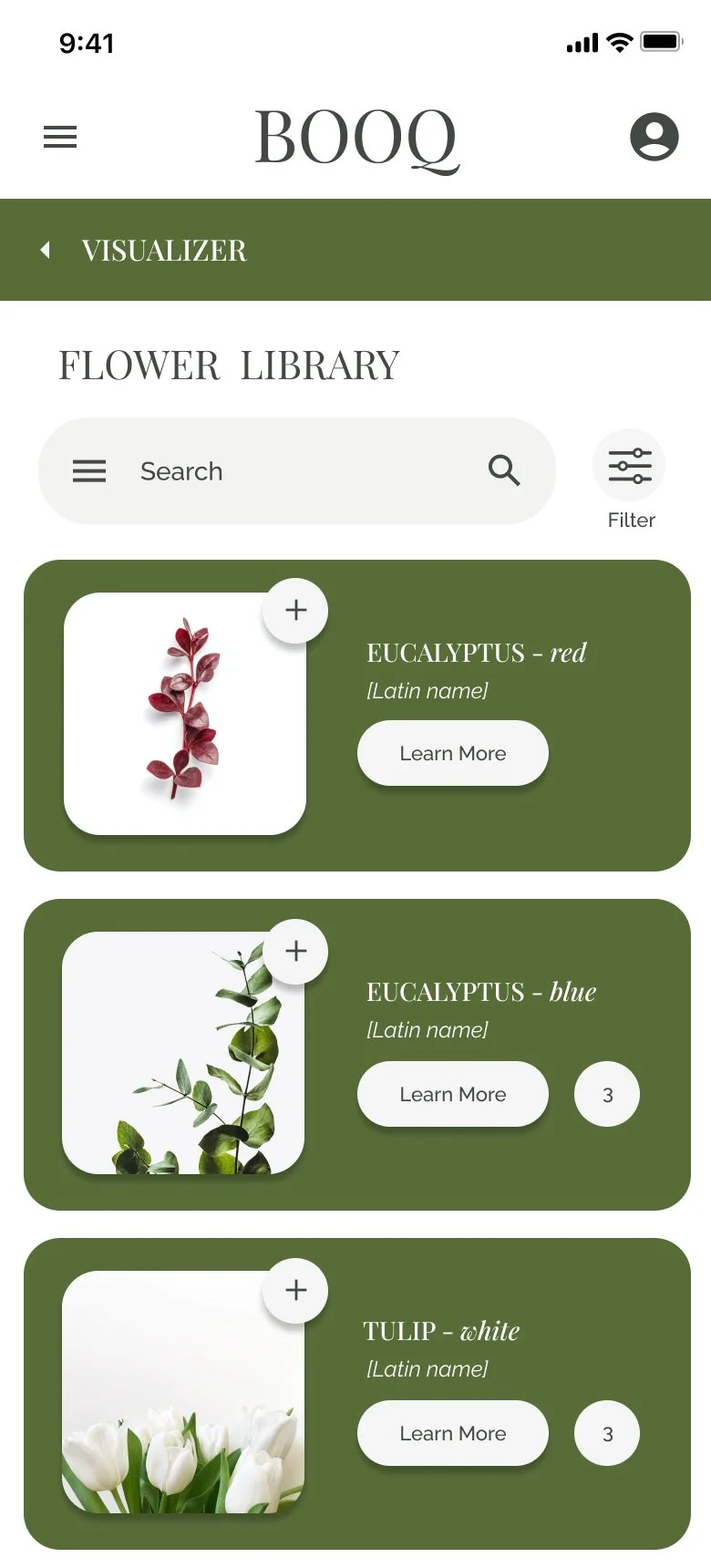
The majority of the features between competitors were very similar, however none of the apps offered price filtering on flowers which would be very useful. Additionally offering multiple ways to visualize the arrangements would build on a feature that only one app offered (bouquets in different vessels, corsages, boutineers, table arrangements, floral arches, etc. Each of the apps had little to offer regarding accessibility which would be another opportunity for Booq to stand out amongst the competition.

Pain Points
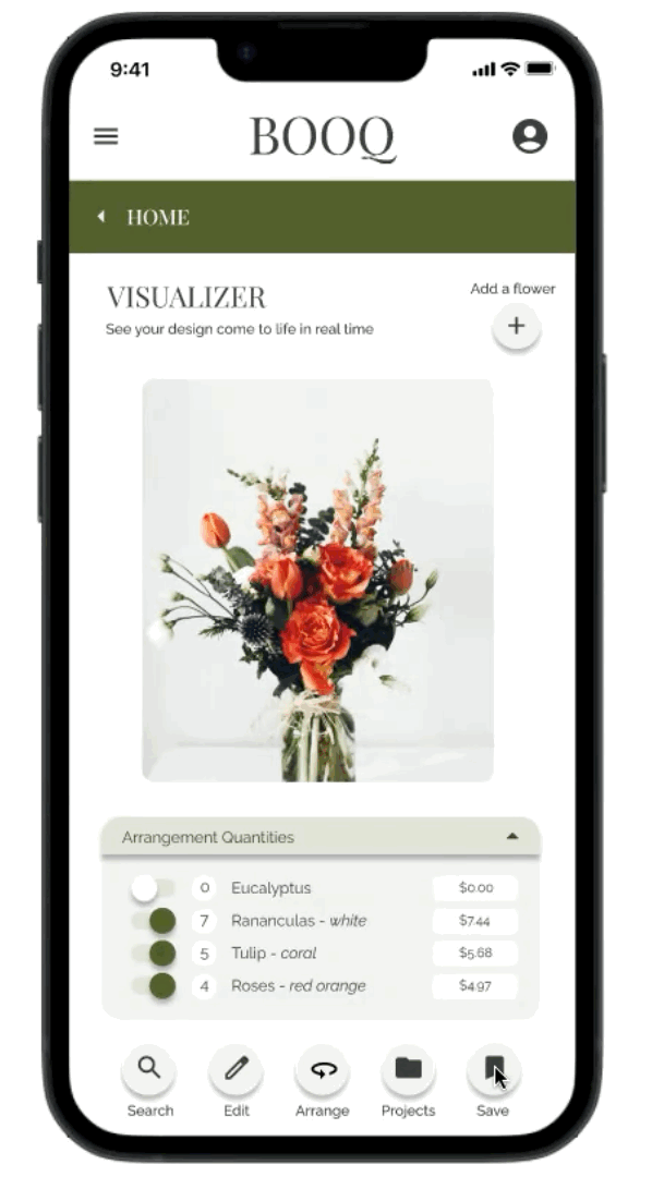
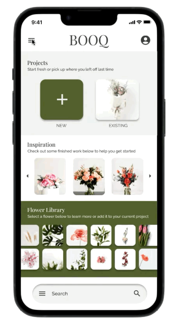
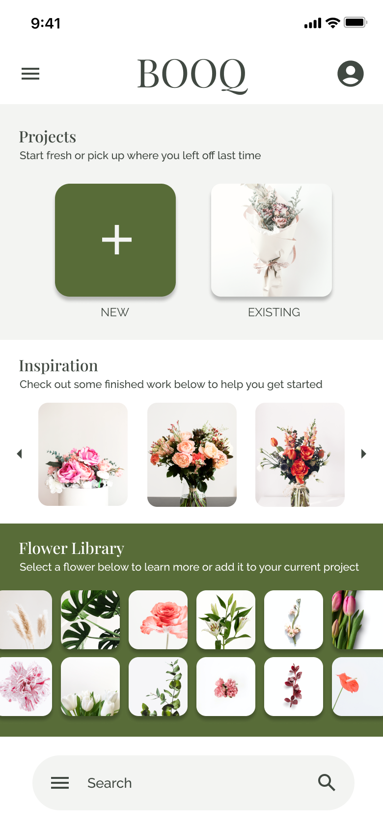
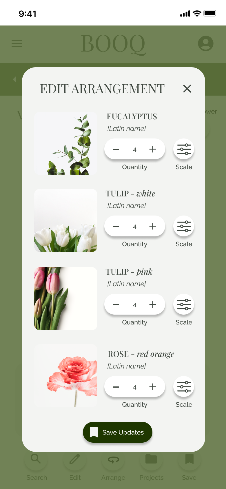
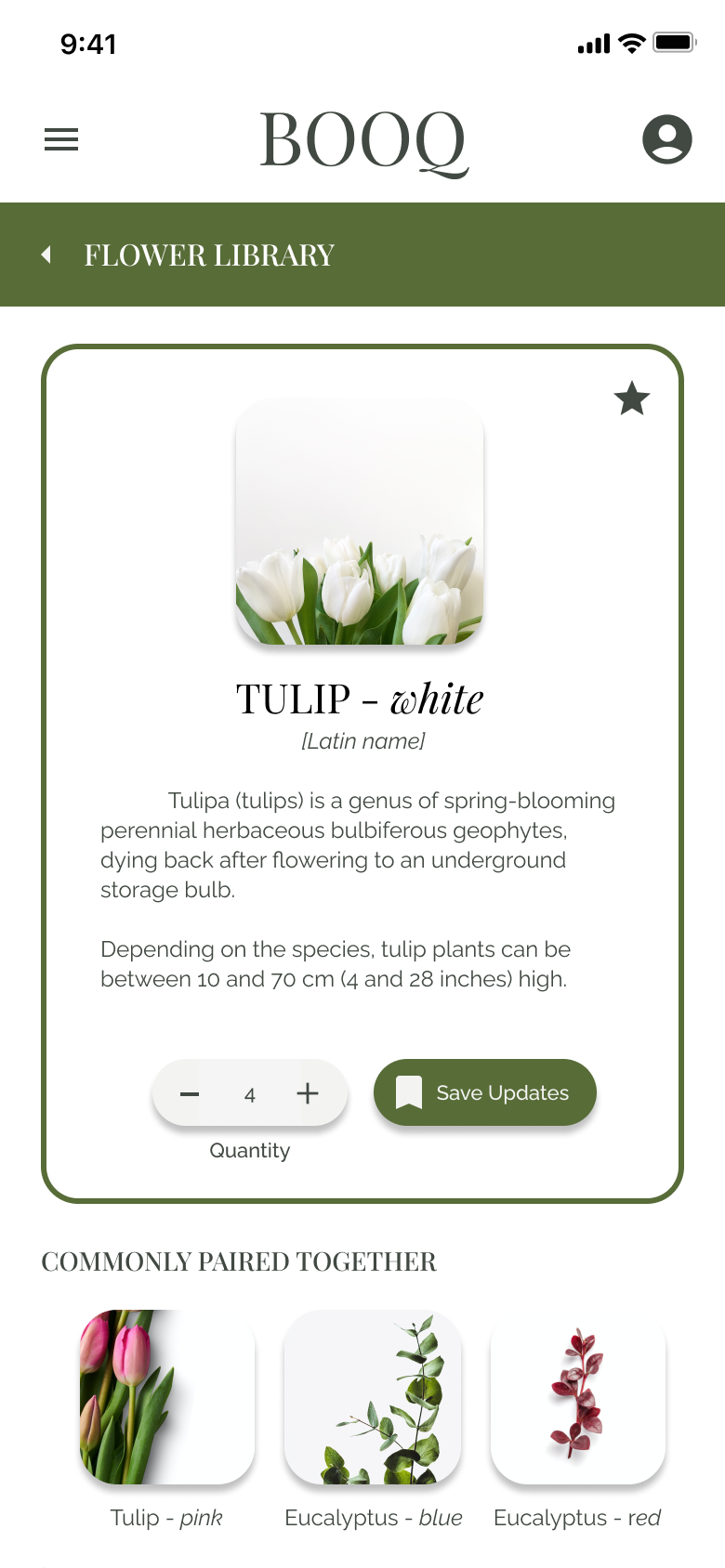
1 CREATIVE PROCESS - An inspiration section, flower library with suggested pairings, and the ability to duplicate/edit existing projects will help florists who feel stuck. Filtering through the flower library will speed up a once challenging hurdle for all users.
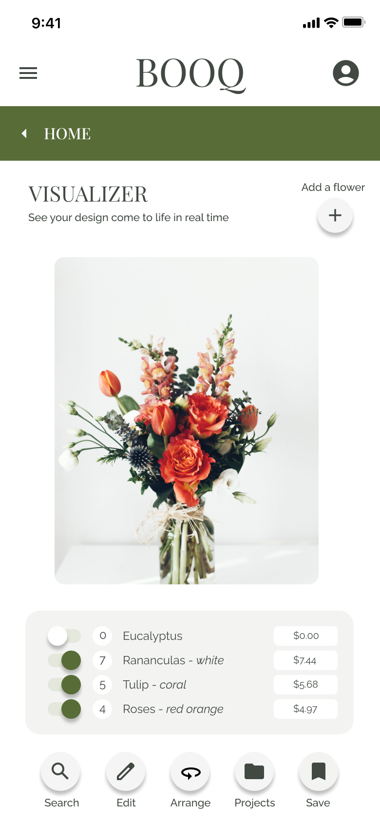
2 COMPLICATED TECHNOLOGY - A simple and intuitive user interface will guide users through the design process allowing them to enjoy the process again.
3 ADMINISTRATIVE PROCESSES - With integrated proposals and calculation, administrative processes will be a breeze for new and experienced florists.
4 HIGH QUALITY DESIGN - Users need to prove their services are worth clients’ investment, so a minimal, classic design with serif fonts and high quality mockups will indicate to clients that the proposals they are receiving are well worth their investment
User Flow

This initial user flow shows what a basic start to finish journey looks like while adding a flower or flowers to a bouquet. This helped determine pages that would need to be created as well as understand ways users could potentially interact with the product.

Wireframes
After sketching out some potential solutions and wireframes to think through the preliminary flow, I created digital low-fidelity wireframes using Figma for the first time. These wireframes were used to create the low-fi prototype that was sent to users for testing before moving on to a high-fidelity design.

User Testing
After creating the prototype, I conducted an unmoderated usability study for participants to complete in their own homes. Five different participants were asked to complete core tasks within the low-fi prototype in order to obtain enough feedback to use for the next set of design iterations.
Research Questions
How long does it take a user to find and add flowers to a design in the app?
What can we learn from the user flow, or the steps that users take, to add, edit, and arrange flowers?
Are there parts of the user flow where users get stuck?
Are there more features that users would like to see included in the app?
Do users think the app is easy or difficult to use?
Research Analysis
After watching the users interact with the low-fidelity prototype, I analyzed the data and created an affinity diagram to separate the data into groups relating to the issues they faced. Users’ quotes and actions were categorized by high priority goals for improvement in saving, project lists, navigation, and quantities in a project. Recognizing these hurdles allowed us to focus on creating a better experience for the user on the next iteration.

Iteration
Insight 1
Saving
It was observed that 5 out of 5 participants were confused by the done and saved buttons from the visualizer. Because it is not clear how to save progress, complete a project, and view previously saved projects, users need more clear language and icons to save projects. Additionally, users need a confirmation screen or some sort of notification that their changes are being saved throughout the app.
Insight 2
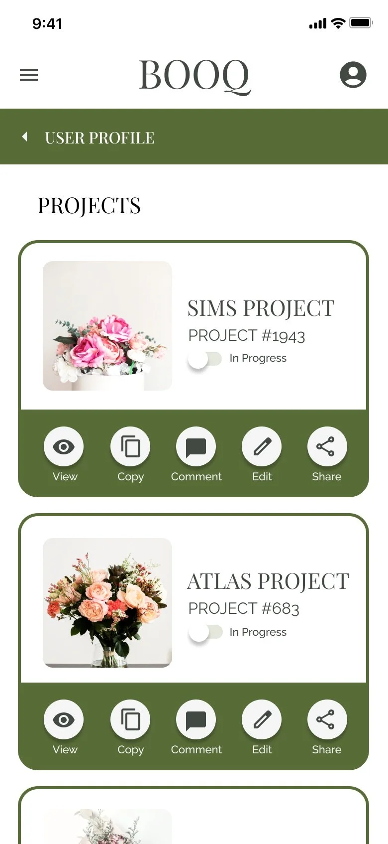
Project Lists
It was observed that 4 out of 5 participants were unsure if the existing projects were the same as the projects listed in the user profile. For that reason, users need clarity and simplification regarding the categories of projects saved in the app (internal, external, existing, in progress, etc).
Insight 3
Navigation
It was observed that 4 out of 5 participants had a hard time knowing how to return to the previous screen they were on. Based on the theme that the back buttons and navigation aren’t completely clear, users need text to accompany buttons and more intuitive ways to navigate back.
Insight 4
In Progress Quantities
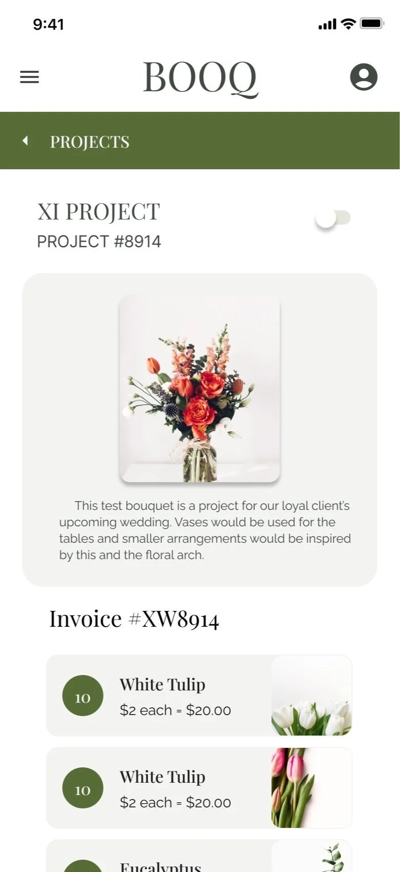
It was observed that 2 out of 5 participants wanted a way to see from how many of a particular flower was in the current arrangement. Since this was only possible if they were already in the edit modal, users need this information to be located in more than one spot.
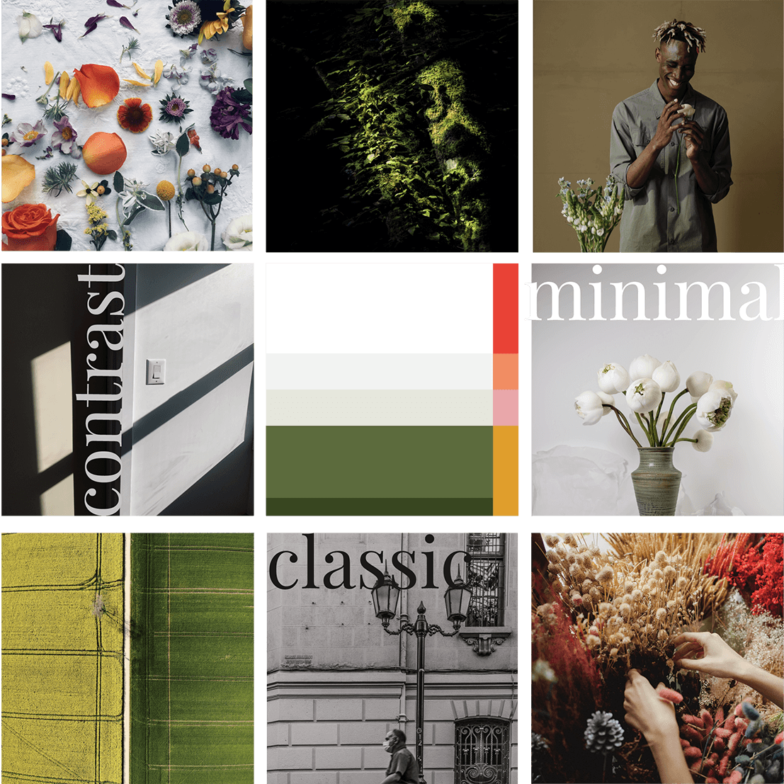
Colors found in nature with a lot of white space create Booq's palette. The minimalism necessary to have the user’s floral arrangements as the focus. The complimenting green feels warm and contrasting enough to create clear user flows and labeling.
Style Guide


Takeaway
As my first UX project, I learned so much through this process of researching and empathizing with users, defining issues, ideating solutions, prototyping, testing, iterating, etc.
There were so many times I thought to myself “how helpful would this process have been as I created solutions for interiors, illustrations, and graphic design clients.” No matter what the business, truly knowing the user is the key to success.
I was surprised by what users found challenging in the low-fidelity prototype which just proved how necessary the usability study research was to conduct. And I did my best to avoid thinking about how the product would be created logistically in an effort to stay as creative as possible through this process (I’m sure that will change when developers are involved!)
Since this wasn’t a “real world” project with data such as downloads or sign ups, I will share this quote from the Usability Study:
"I like the simplicity of (the app) and it's layout. I feel like it just makes a lot of sense and it's very user friendly. My only dislike is the fact that it's still a prototype. So I'm very excited, and I hope it all ends up working out, because I feel like it would be a lot of fun to use!"
-Participant C